PROJECT CREATED FOR INTERMEDIATE TYPOGRAPHY
INSTRUCTOR: PHILLIP DIBELLO
INSTRUCTOR: PHILLIP DIBELLO
In this project, I explored the concepts of less agency and more agency in design. More agency gives the designer greater control over how the content is presented, guiding the reader’s experience and interpretation, while less agency gives more freedom to the reader, letting them navigate and interpret the text with minimal interference. I created two versions of the project—one reflecting more agency, and the other reflecting less agency. My understanding of the designer’s role was to organize the text in a way that guides the reader, making the content clear and engaging.
LESS AGENCY VERSION
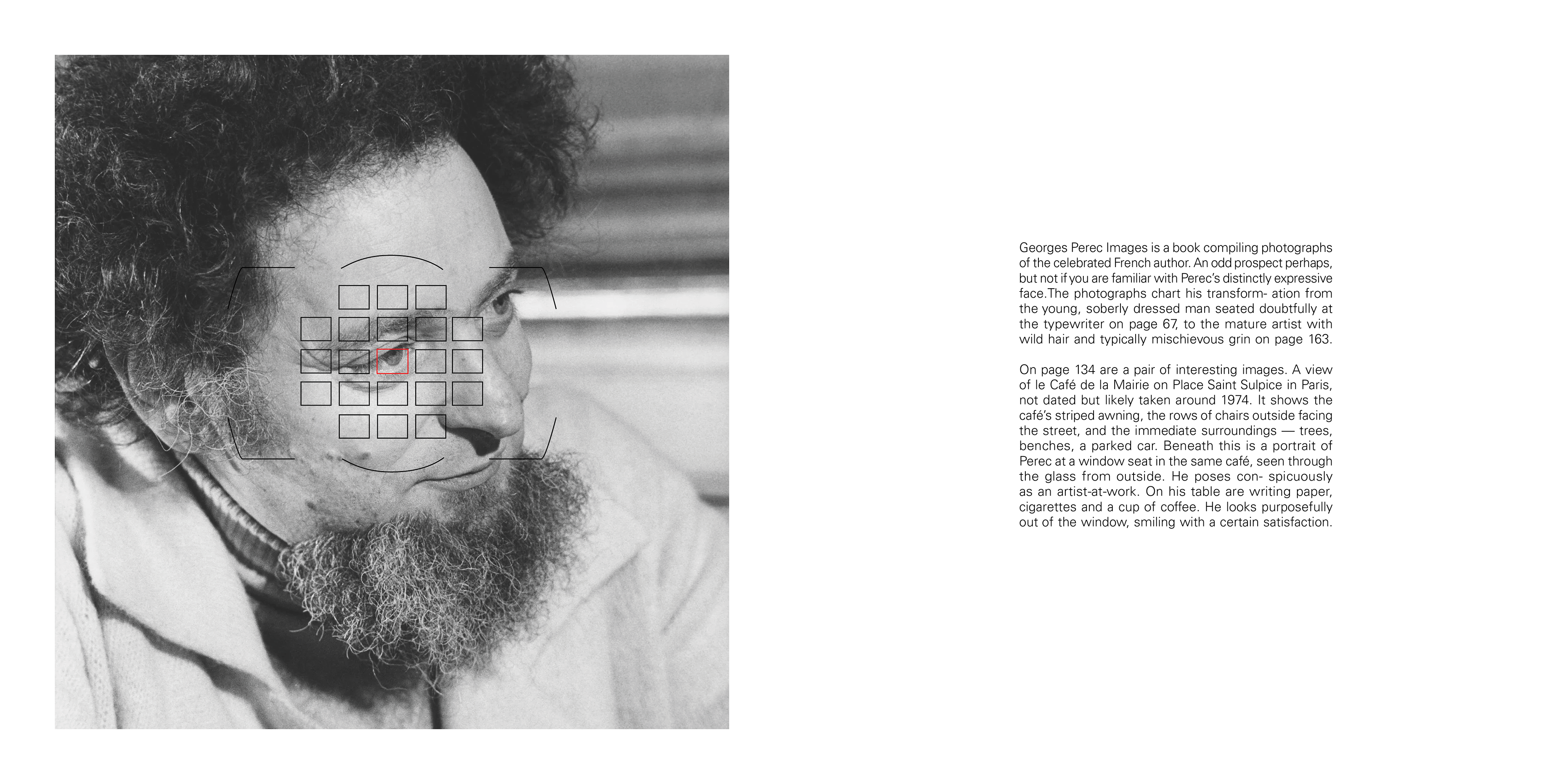
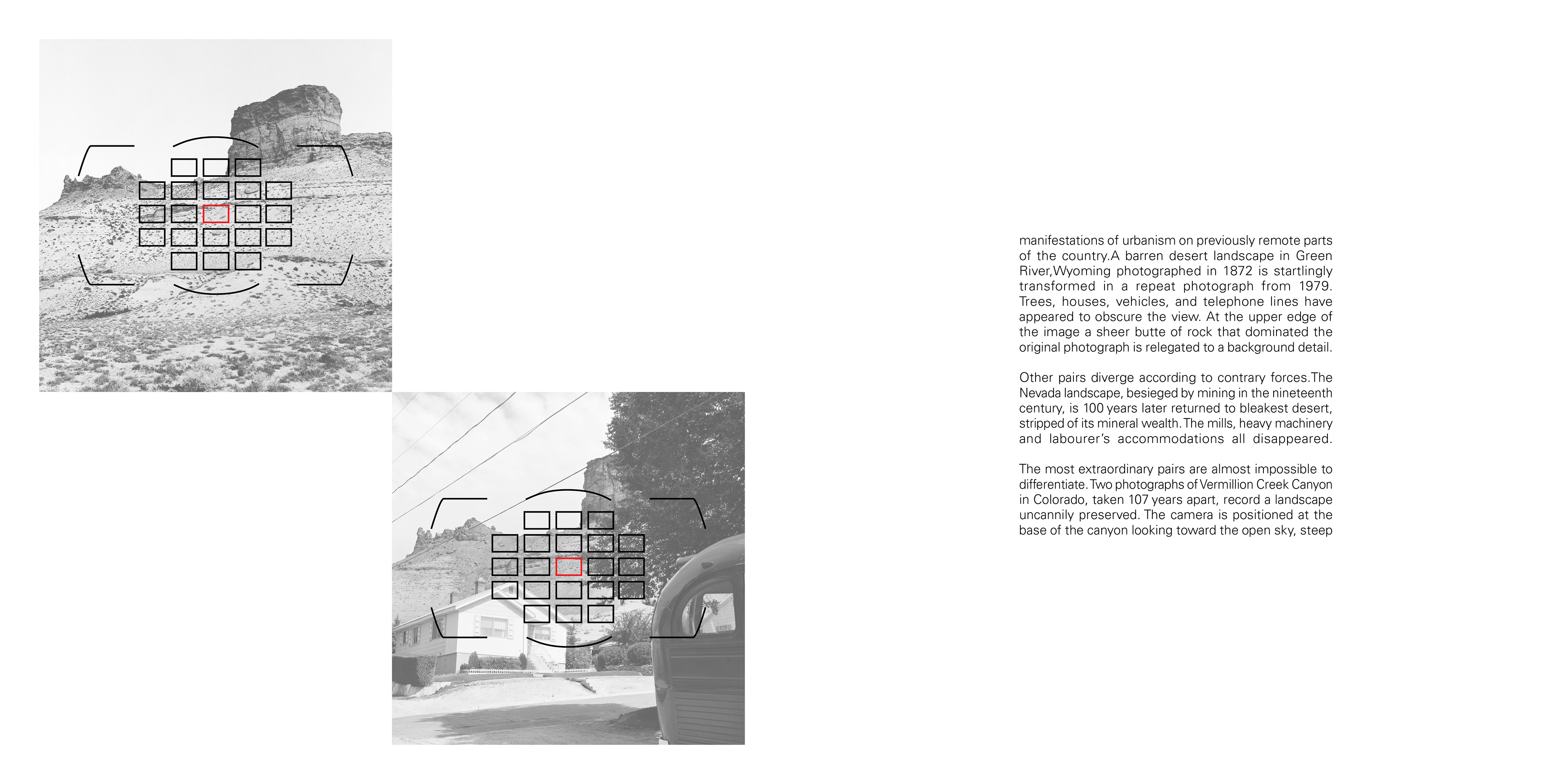
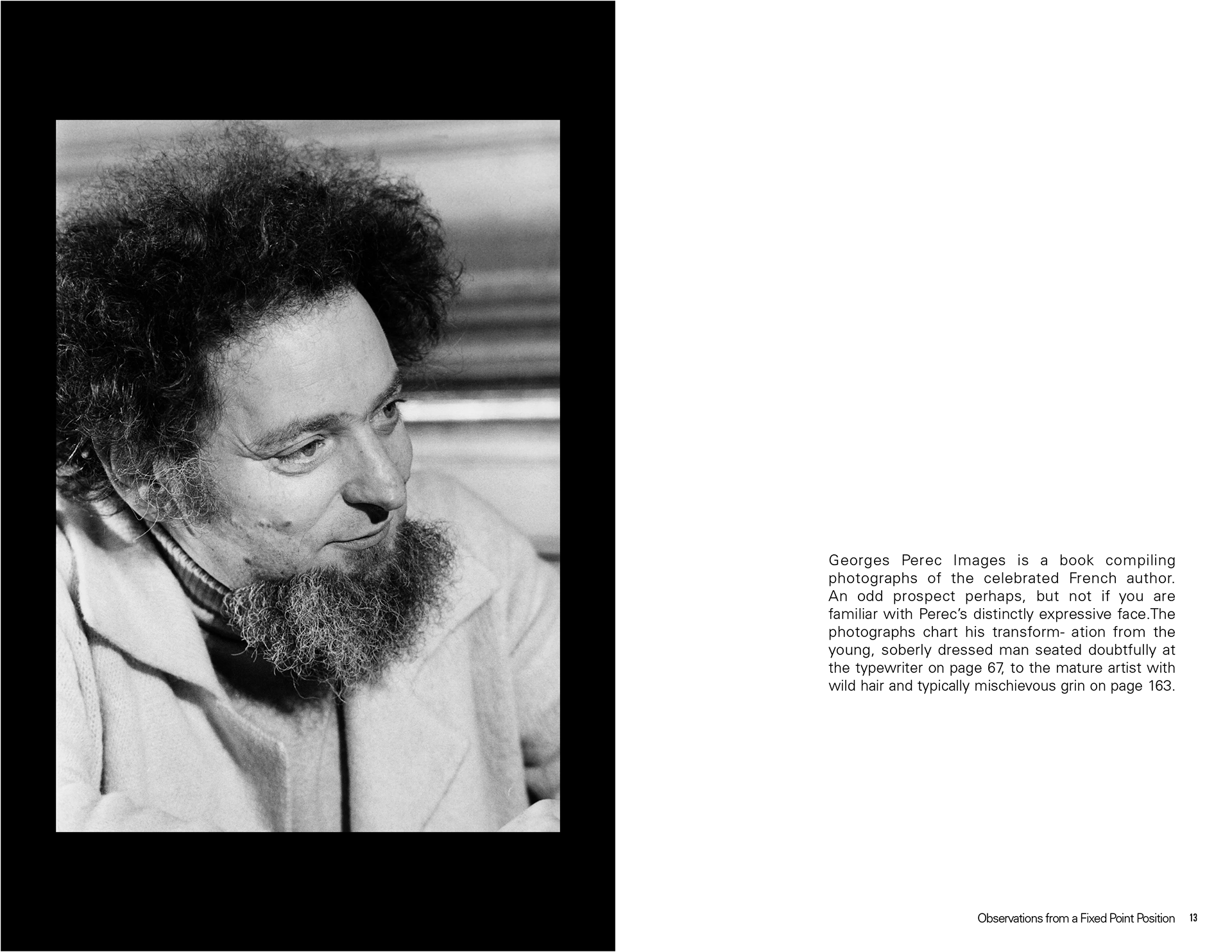
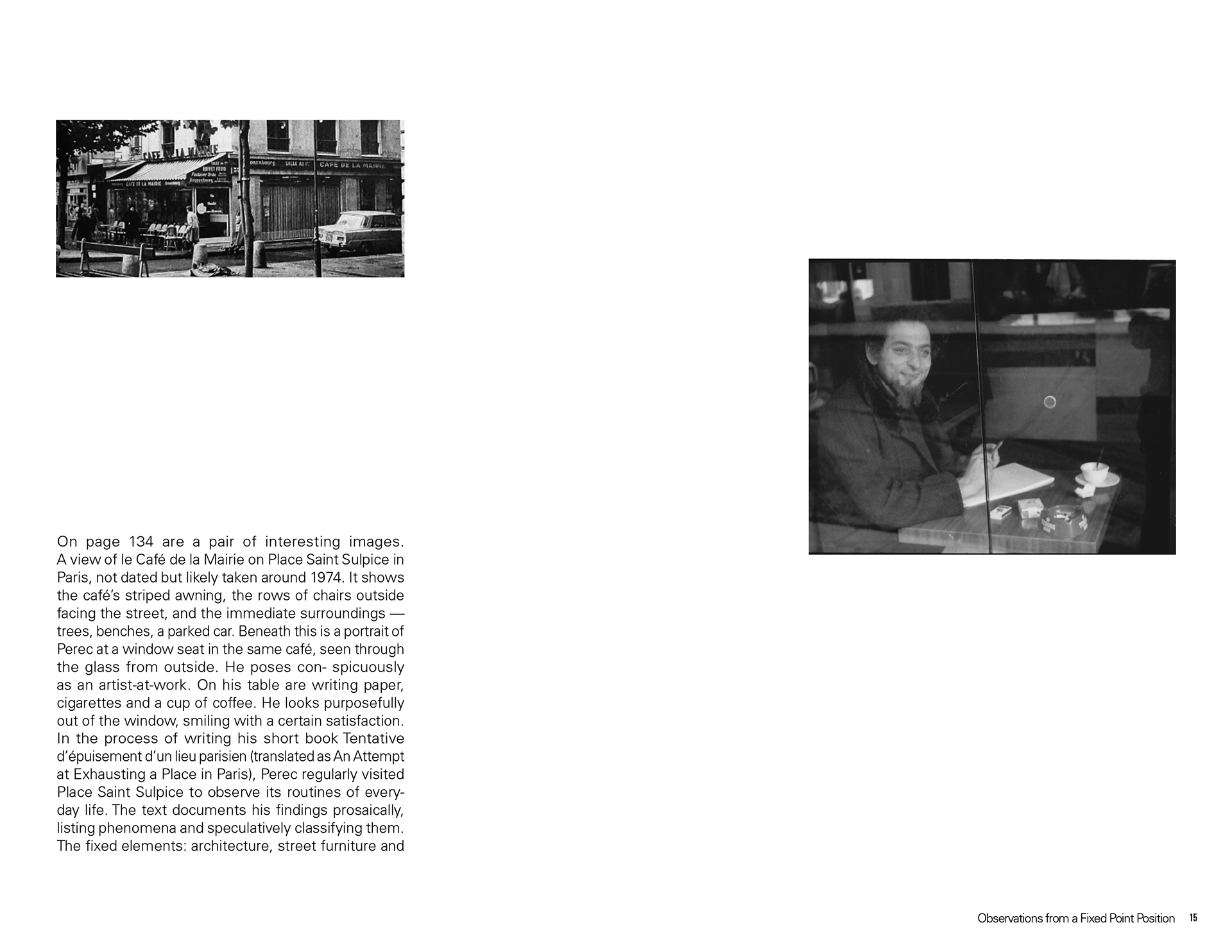
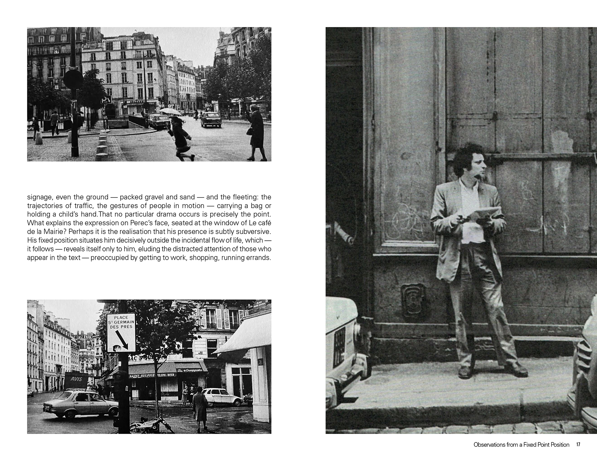
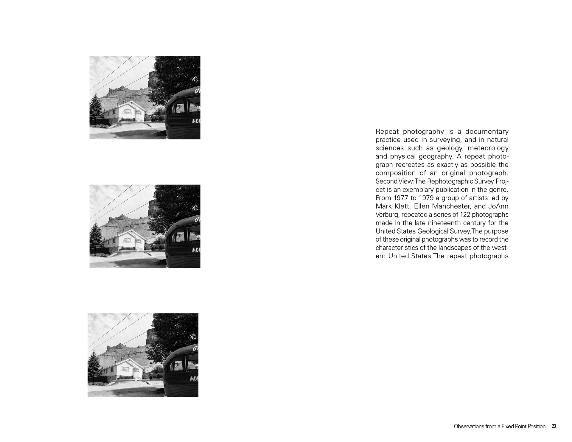
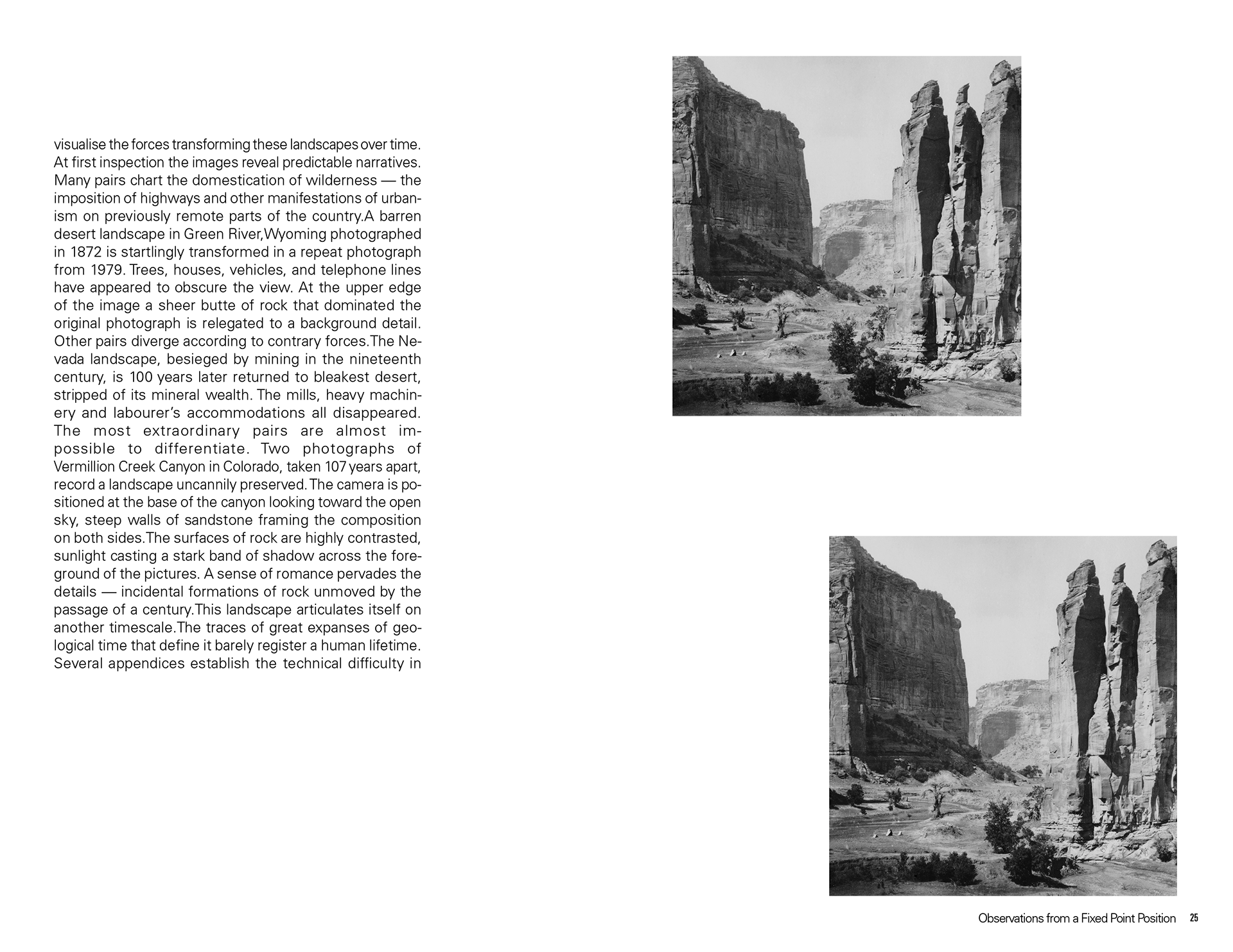
For my less agency version, I chose a black-and-white color scheme to avoid influencing the reader’s interpretation with color. I focused on organizing the text for clear comprehension, using a dynamic layout and incorporating images to help the reader understand exactly what is
being discussed.
being discussed.


More agency version
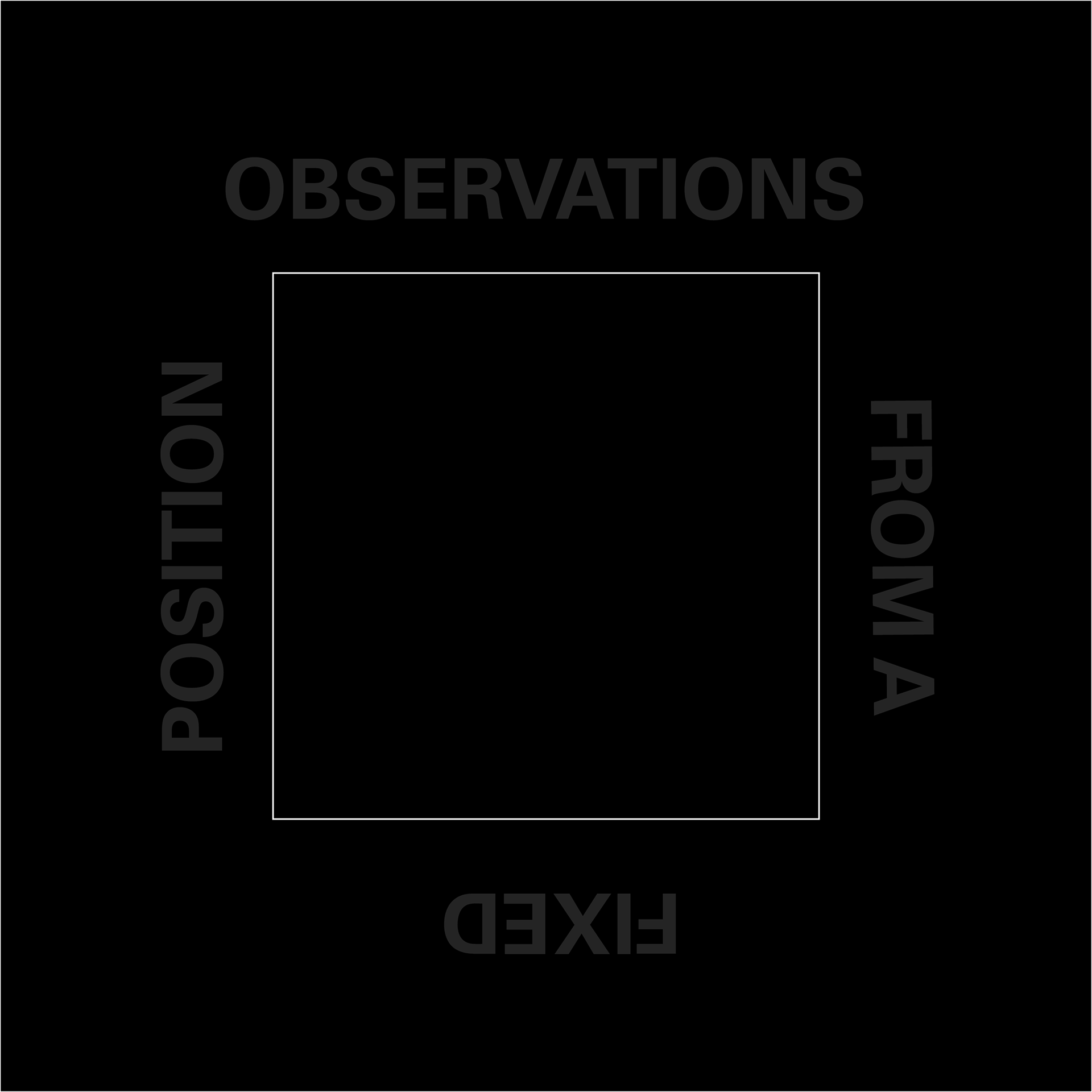
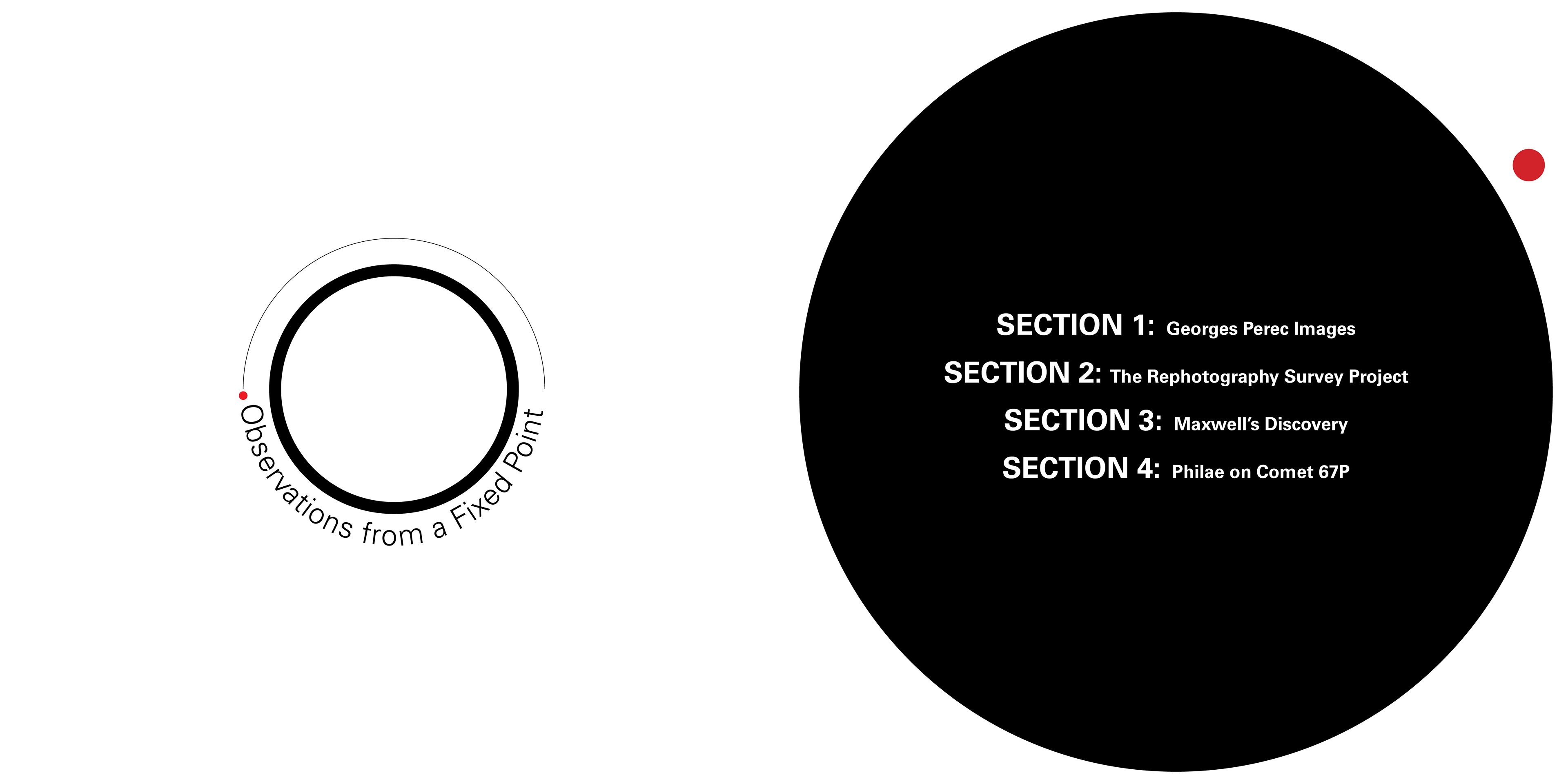
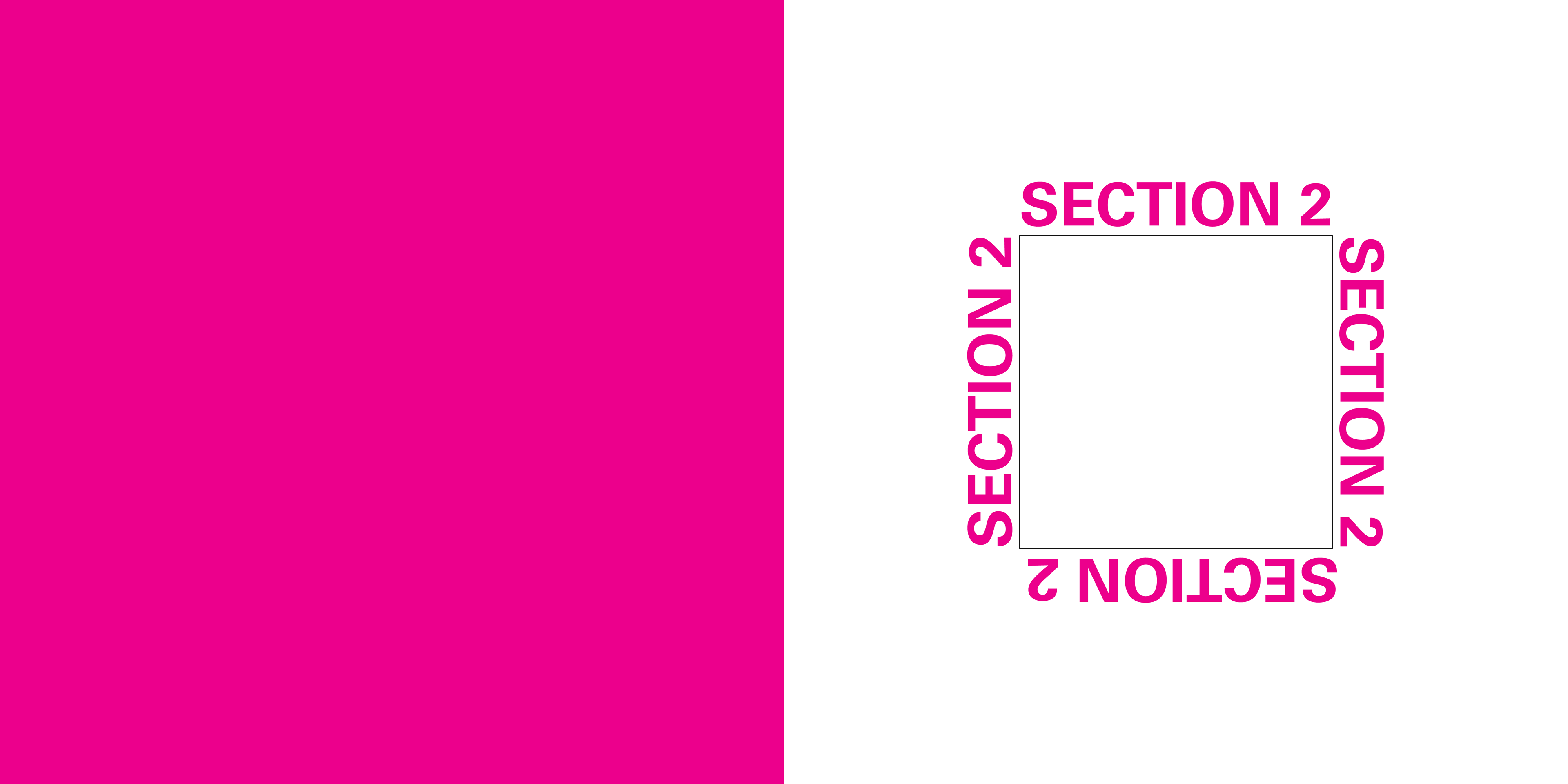
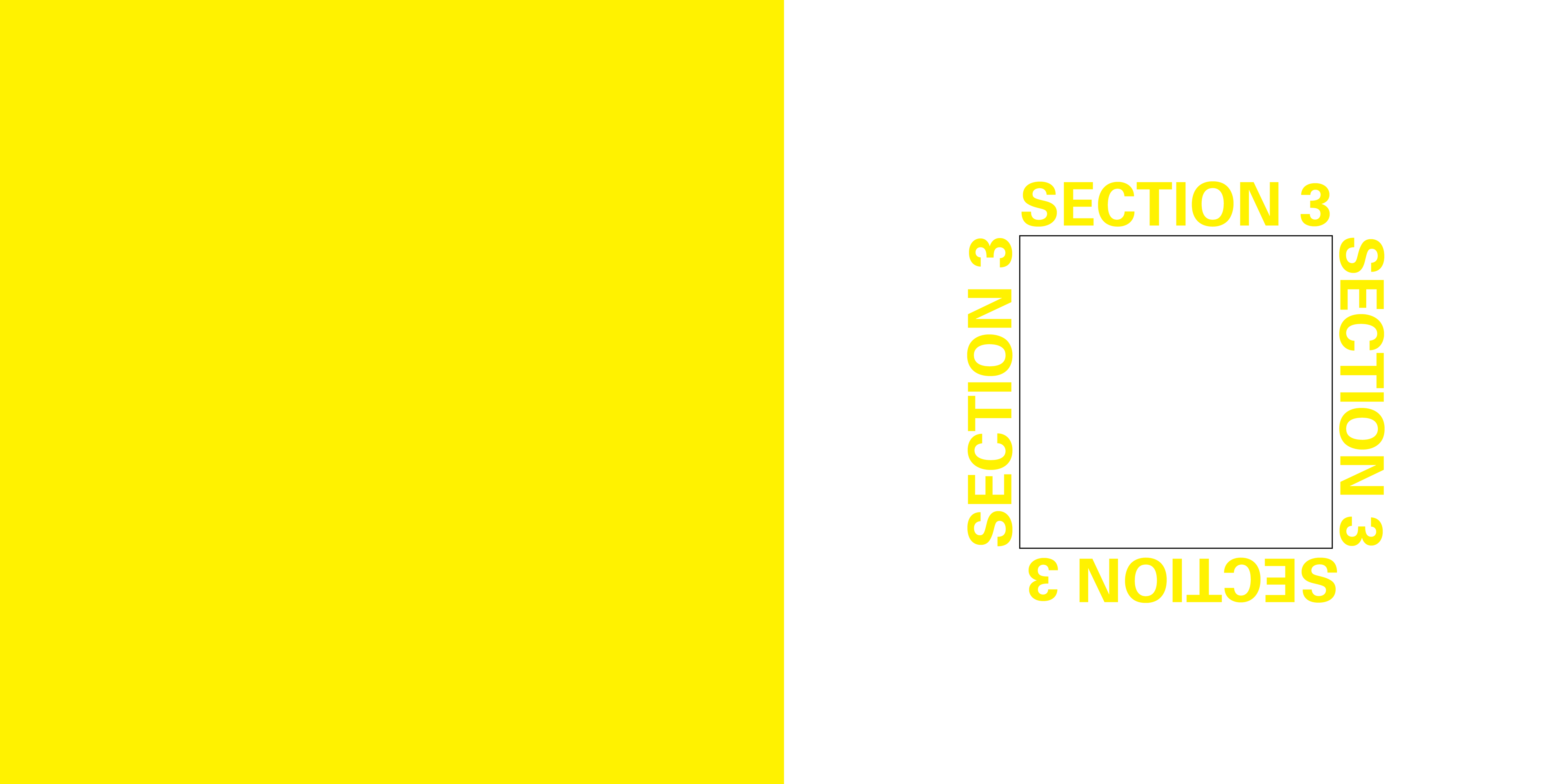
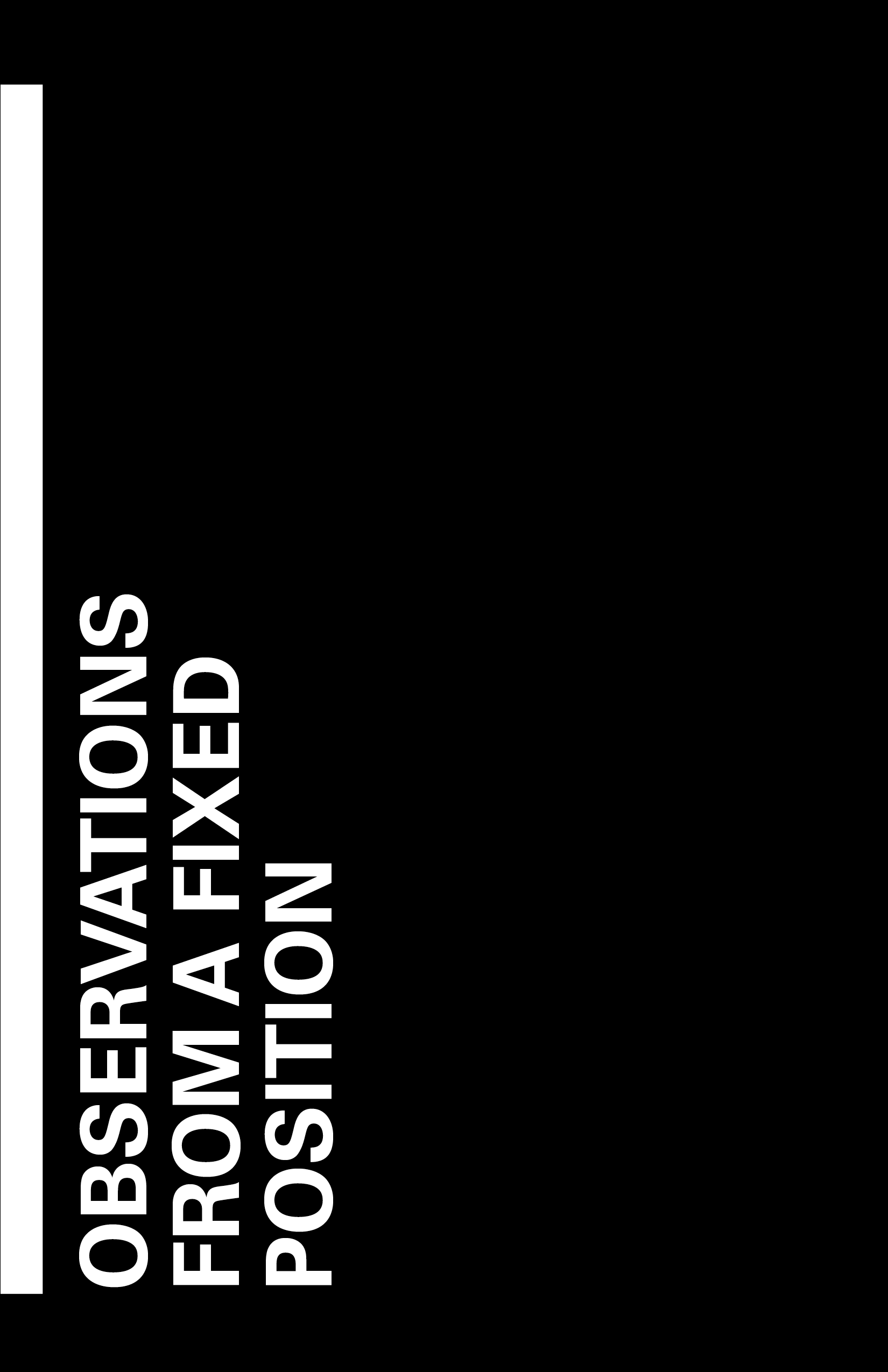
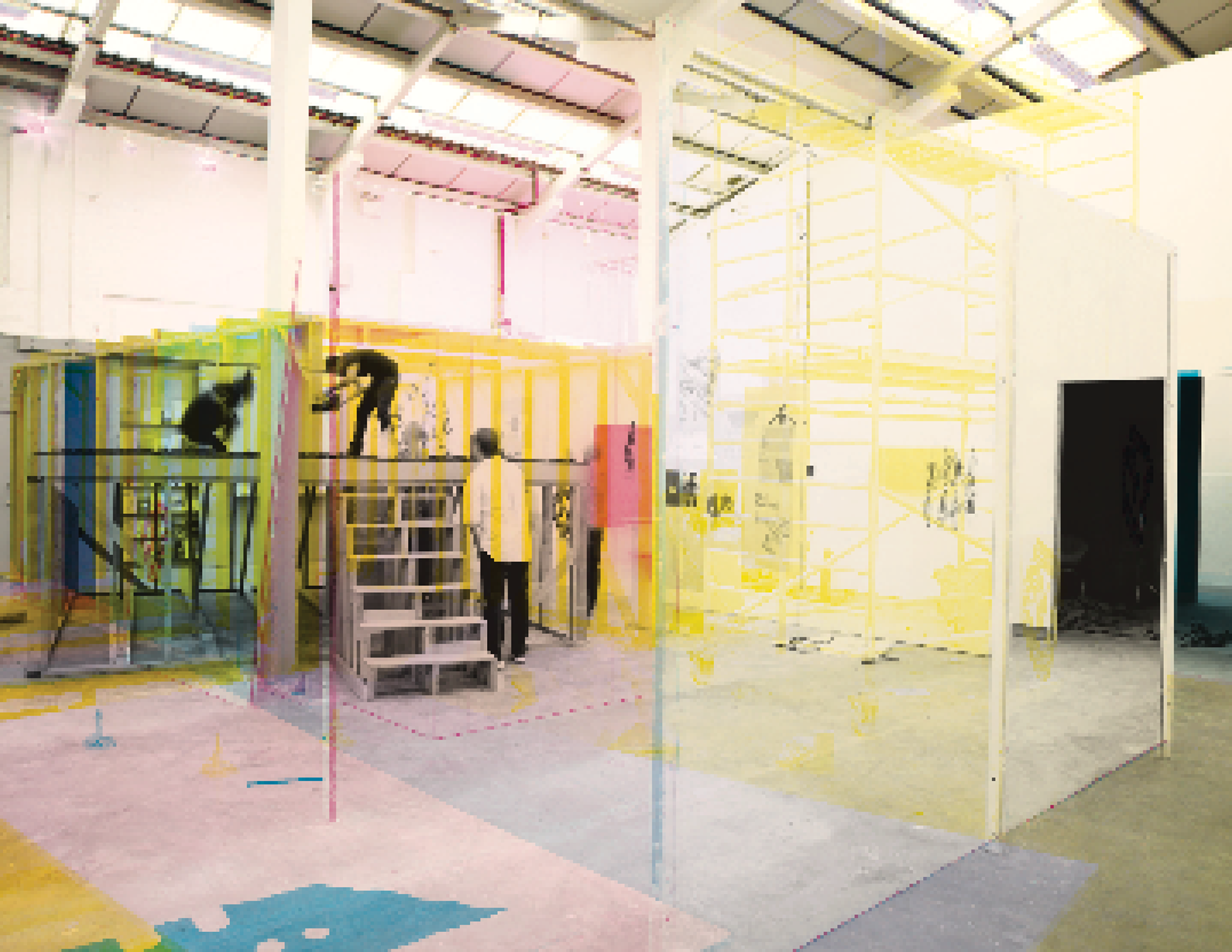
This project is inspired by Observations from a Fixed Position by James Langdon. It explores framing through geometric shapes, using the square as a “fixed position” reference that echoes photography and camera perspectives. Patterns and textures were developed based on photographic elements such as aperture, focus, and lens. The final piece uses layered vellum paper to create depth and overlay, bringing the concept to life while emphasizing the CMYK color scheme referenced in the text—using only cyan, magenta, yellow, and black.